Role: Graphic Designer - Google UX/UI Certification Program
For my UI/UX Certification program, I was given the prompt to create an in-app menu for a cafe. Moondust Cafe is a fictitious cafe that serves coffees, teas, sandwiches, breakfast items and sweet treats based upon a space-related theme.
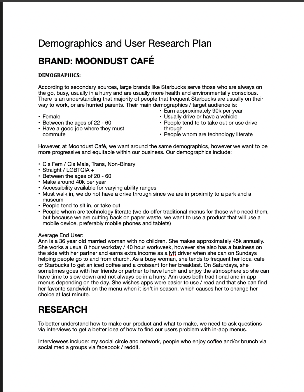
RESEARCH
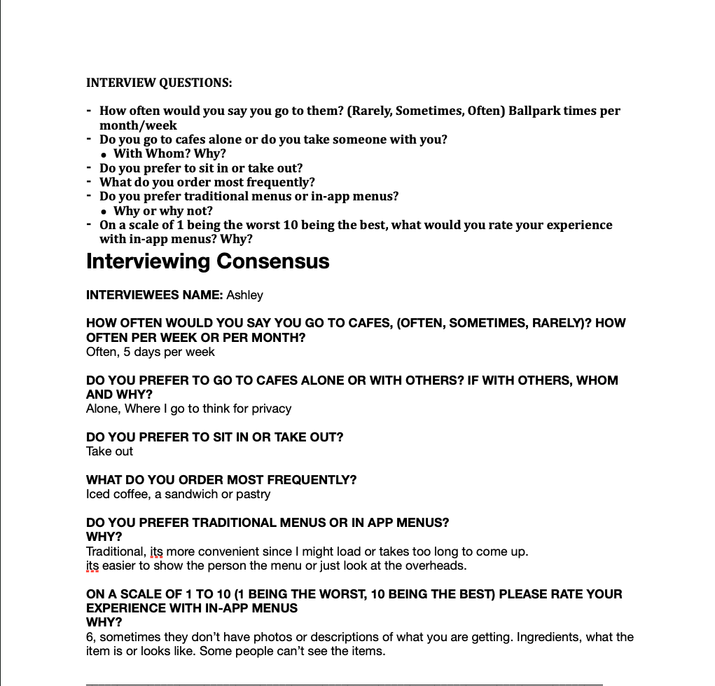
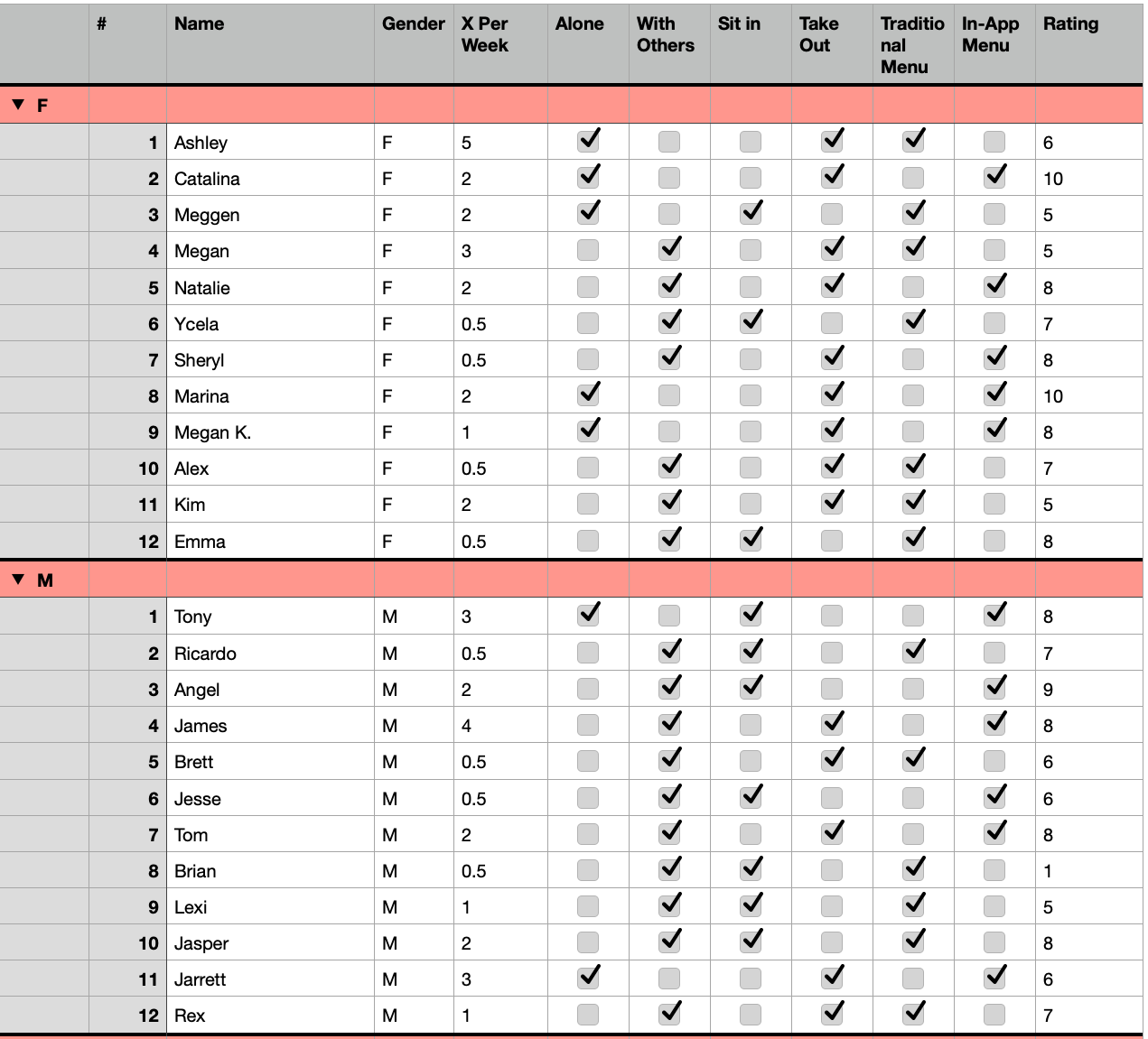
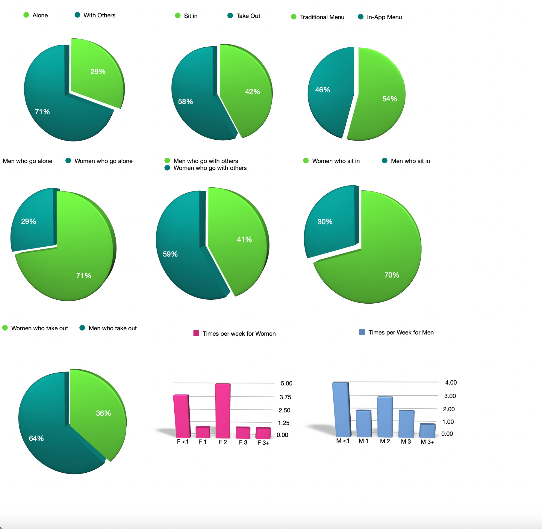
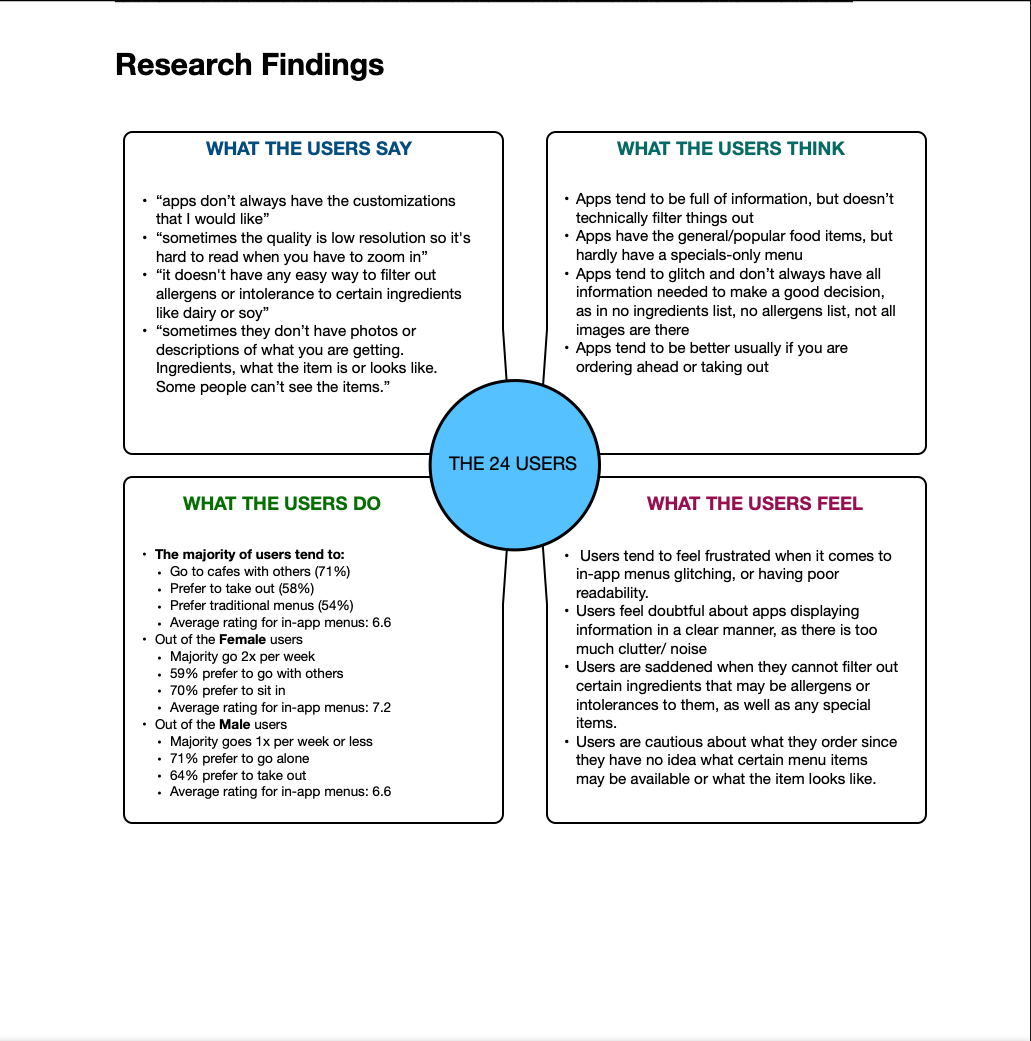
I had used previous marketing research methods in order to compare Starbucks Coffee, The Coffee Bean & Tea Leaf, McDonald's and Dunkin Donuts for trends in target audience, items served and layouts of their apps and websites. I also performed a quick concensus of 24 interviewees on what they order, how do they prefer to eat at cafes, with whom and how often.
SWOT AND COMPETITIVE ANALYSES
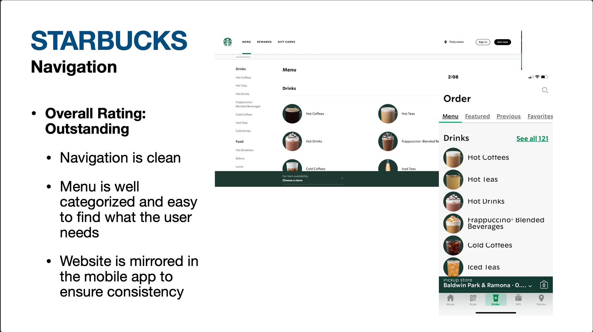
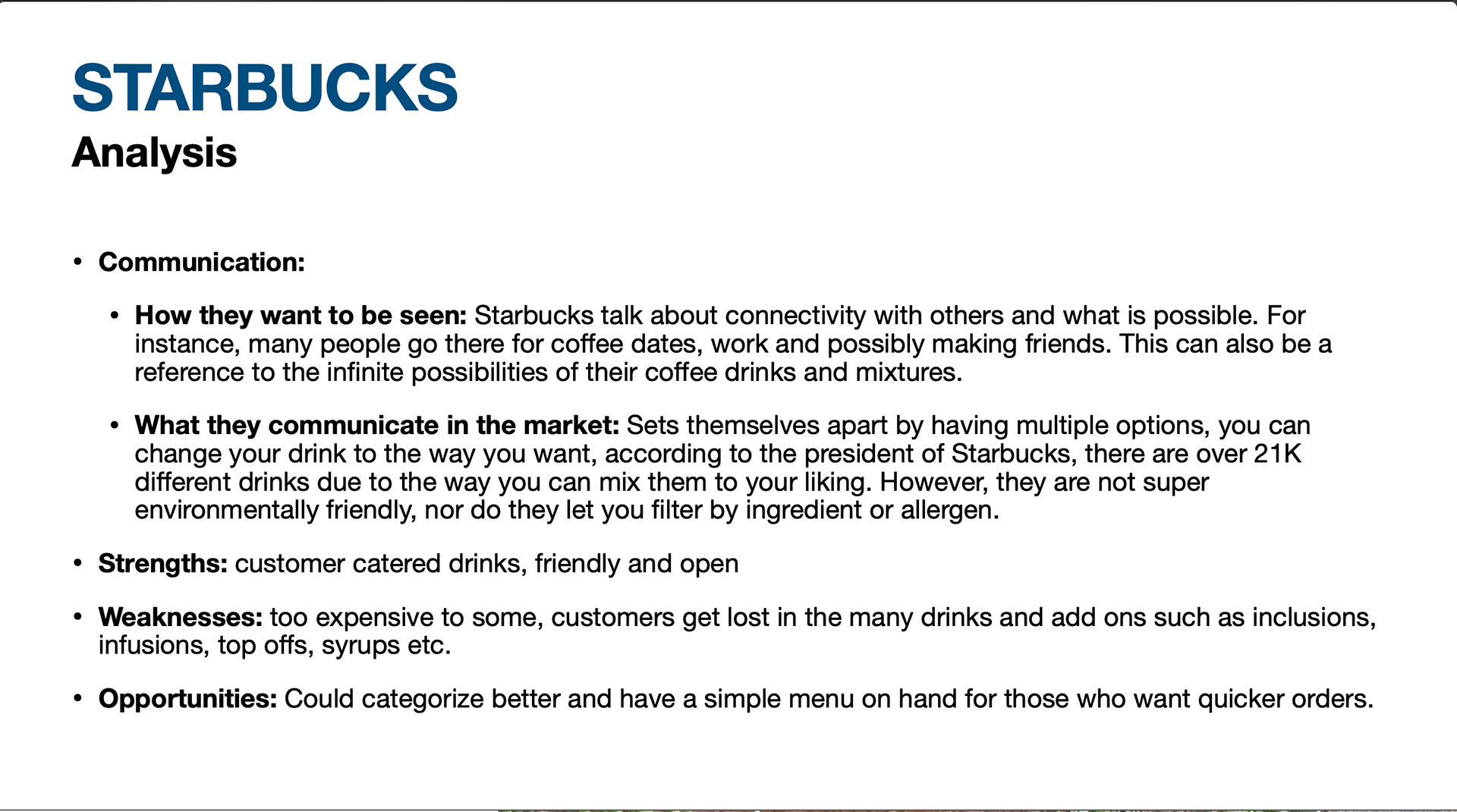
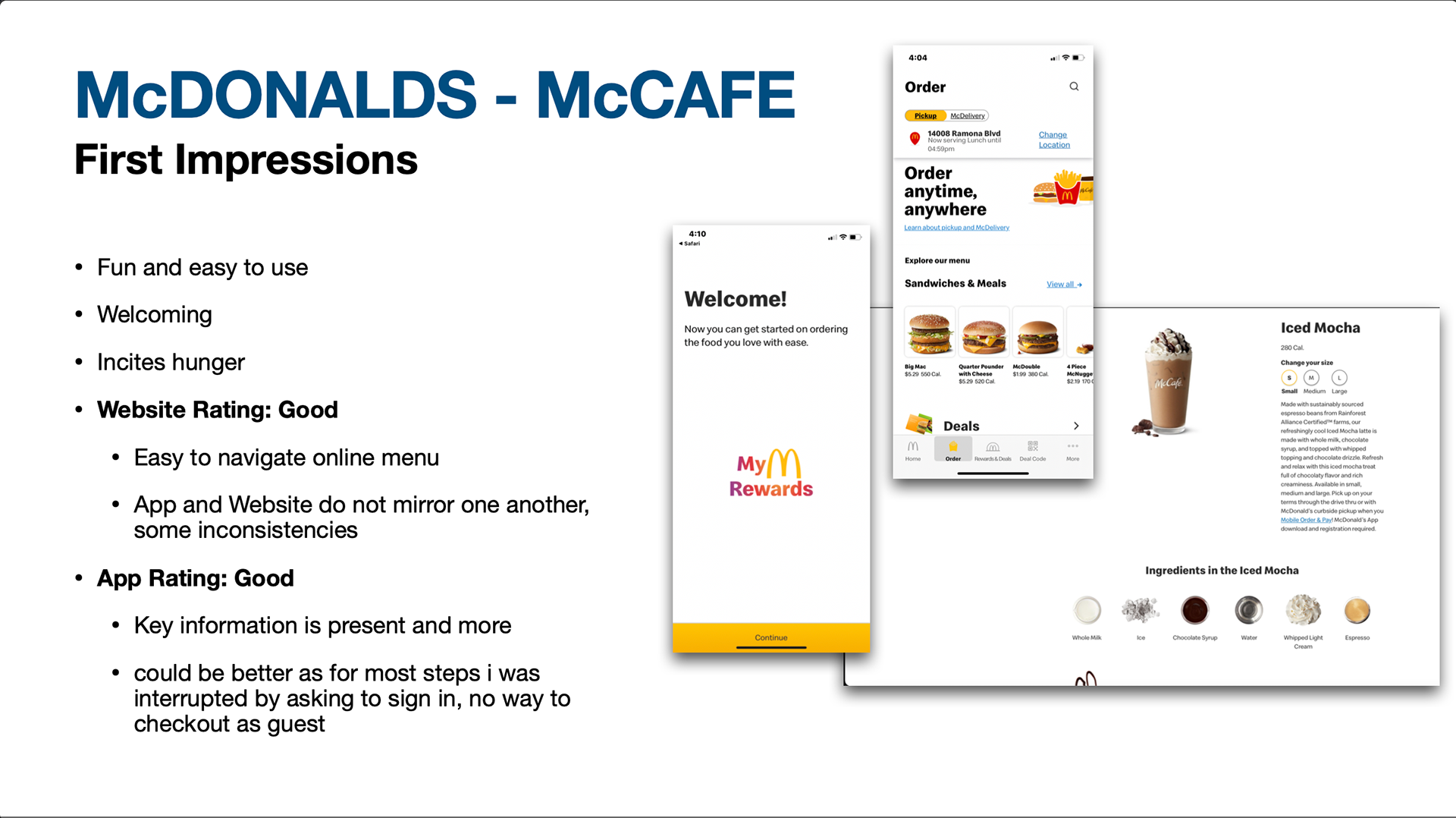
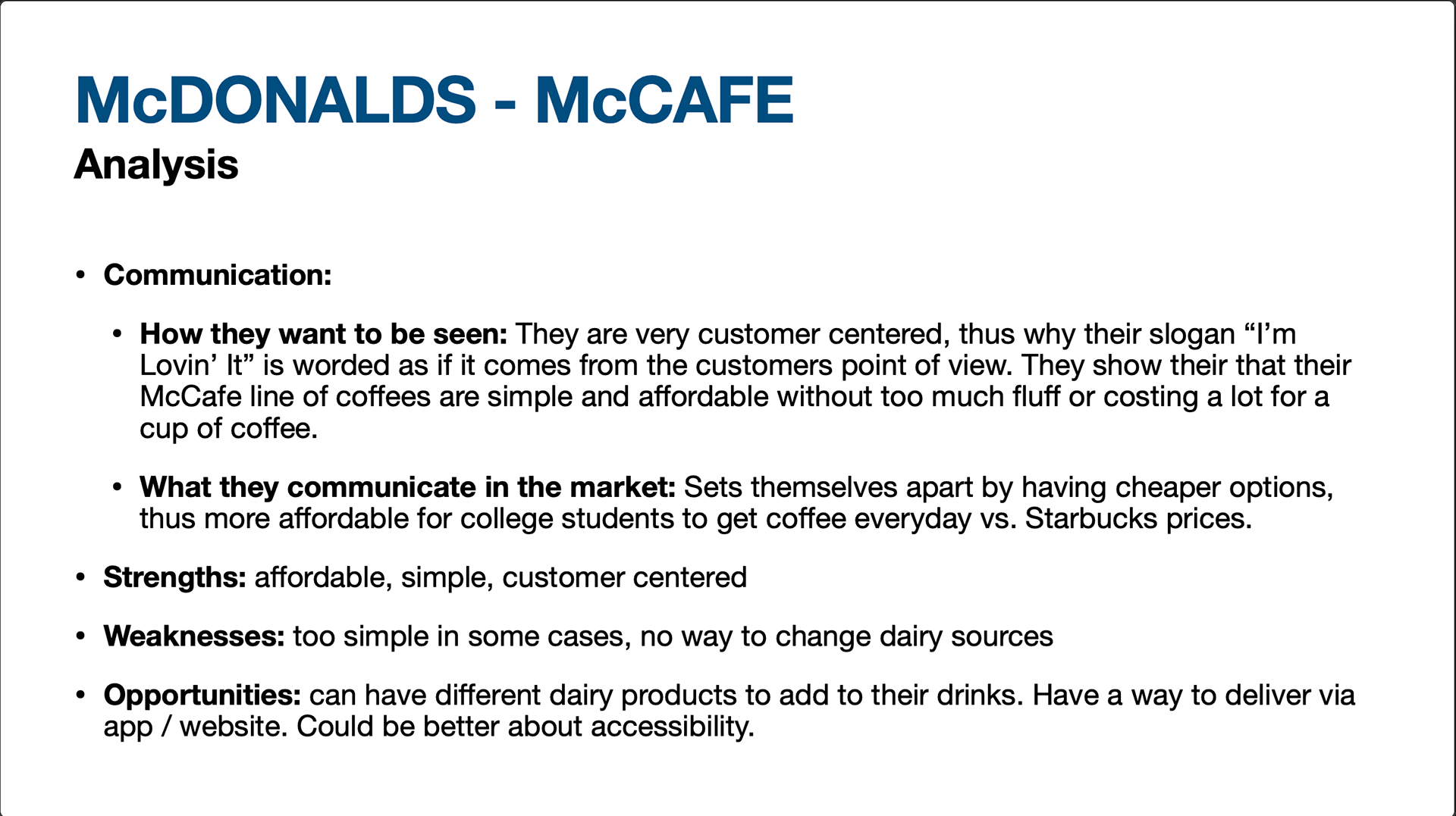
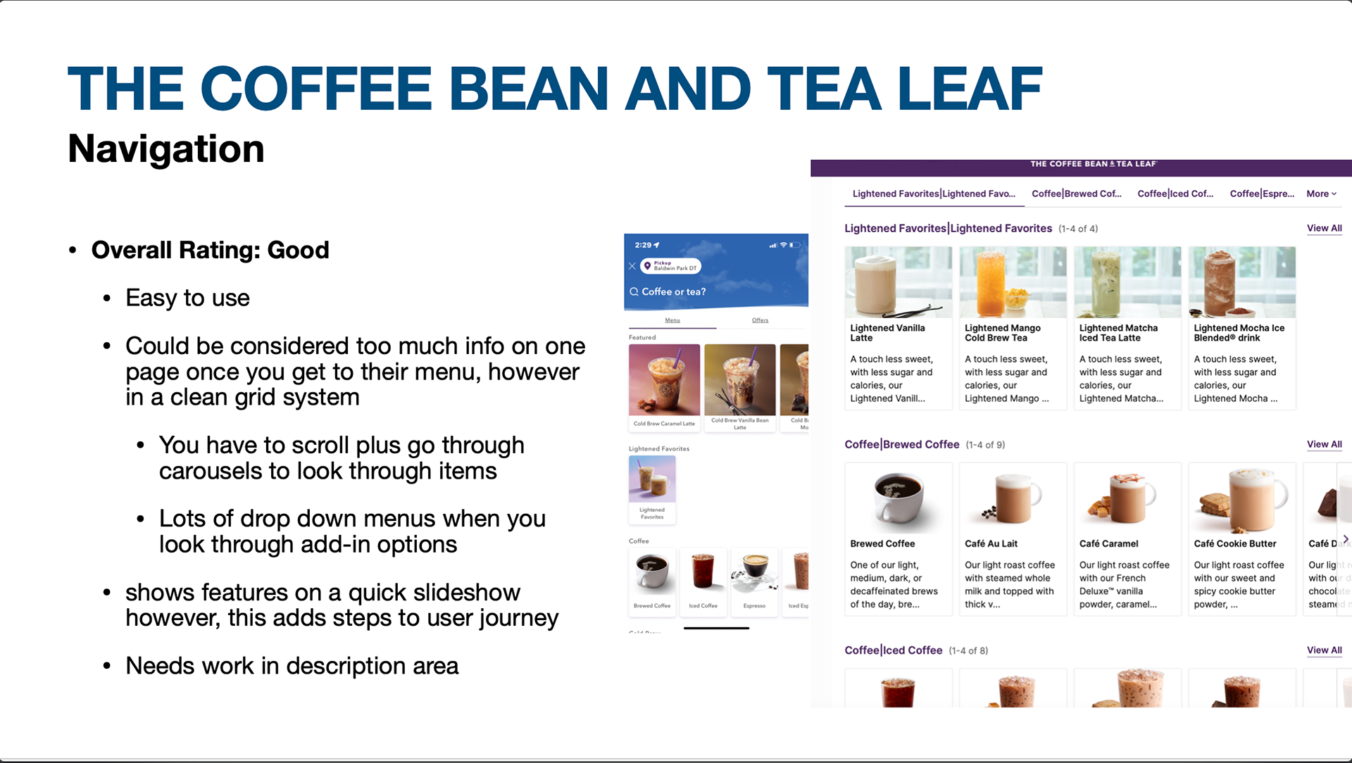
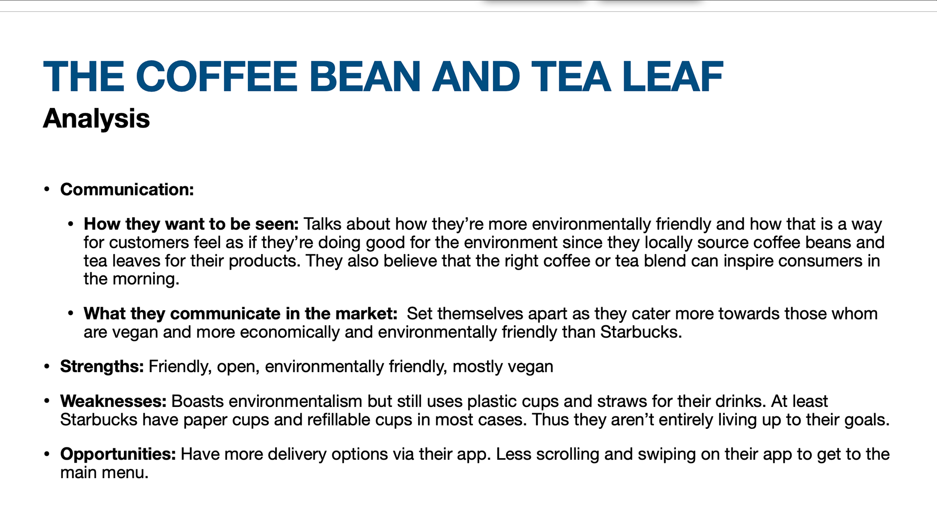
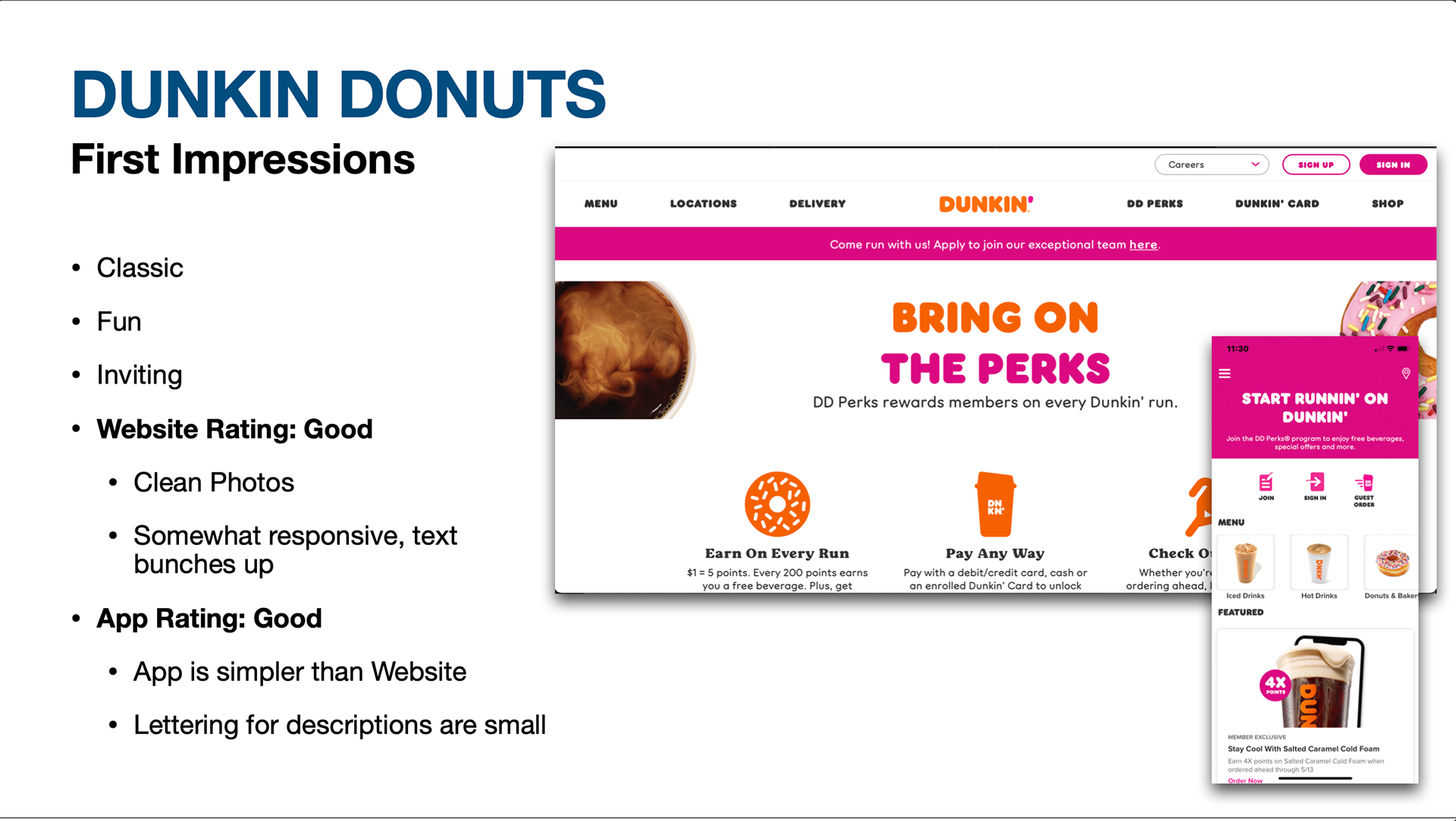
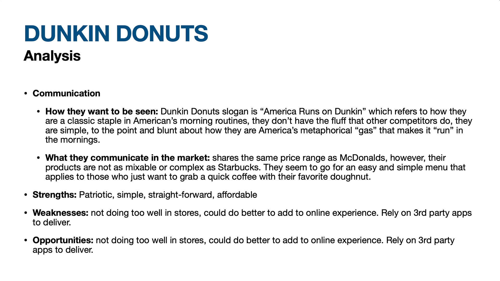
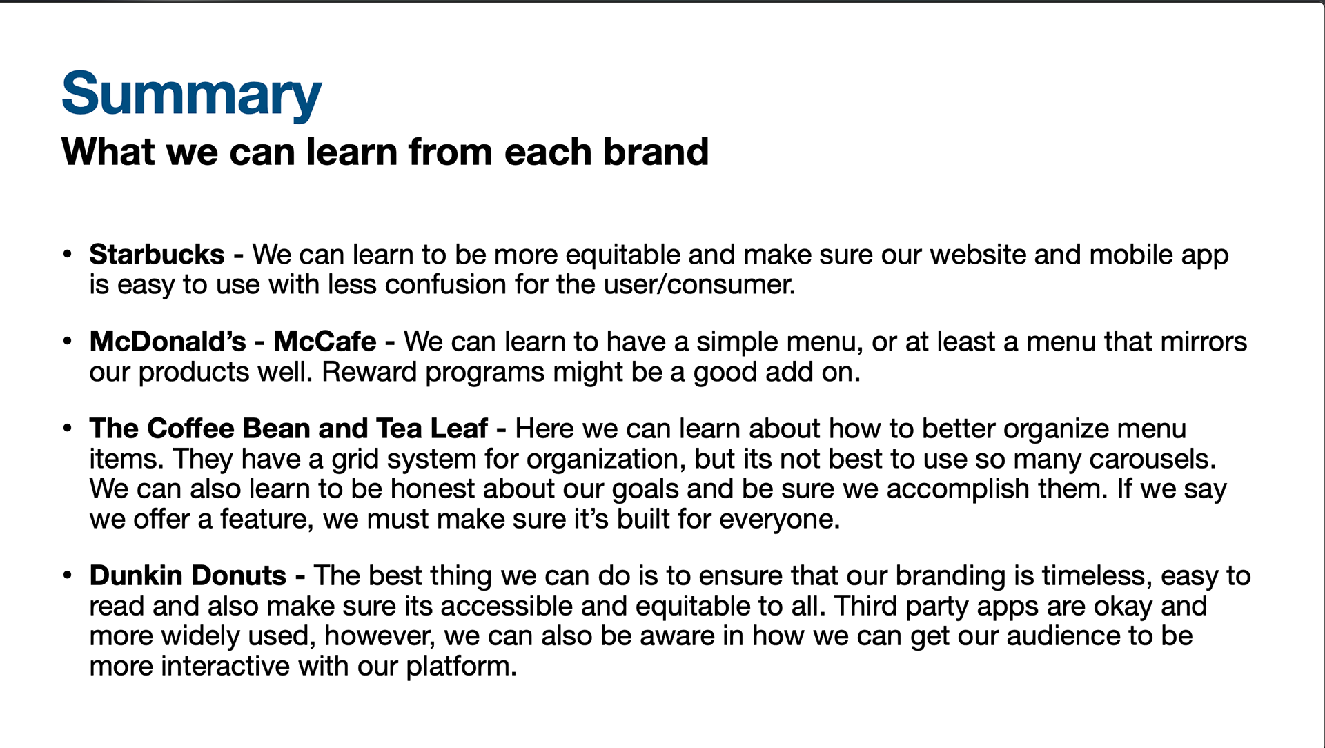
Prior to interviewing, I did a SWOT/ Competitive analysis of Starbucks, McDonalds, Dunkin and The Coffee Bean & Tea Leaf companies. I compared each company based on app and website navigation, first impressions, target audience, visual design and branding, as well as took notes on any strengths or weaknesses each company had with their design. Based on the patterns I saw with the companies, I compiled the list of potential users which I then interviewed for Moondust Cafe.
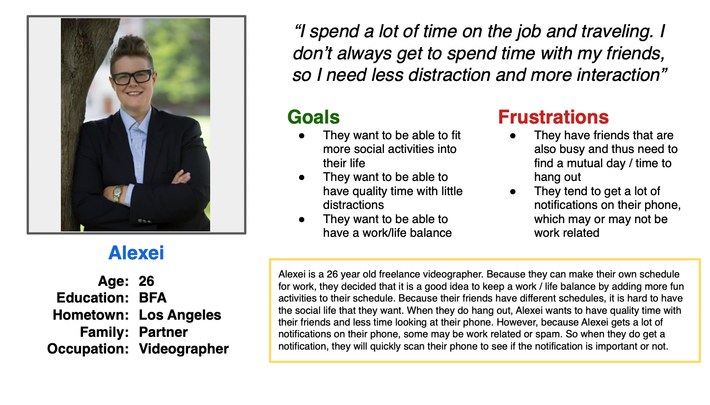
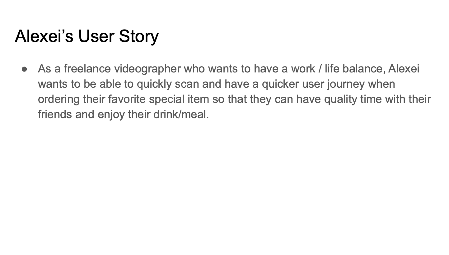
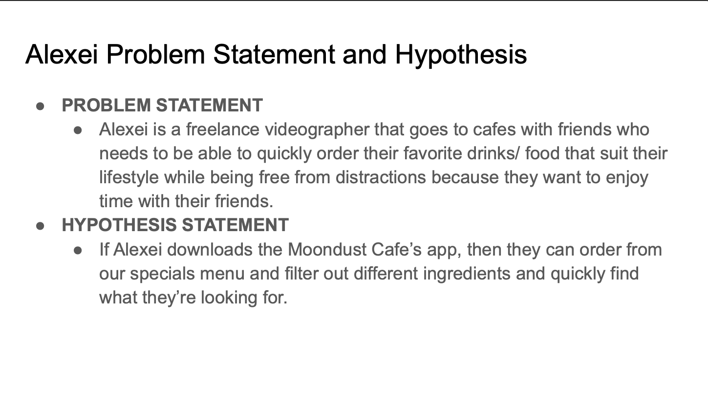
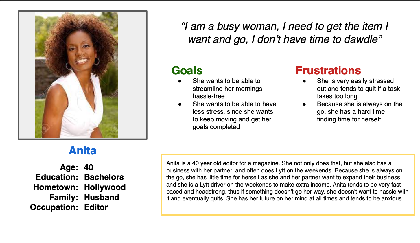
PIECING TOGETHER PERSONAS
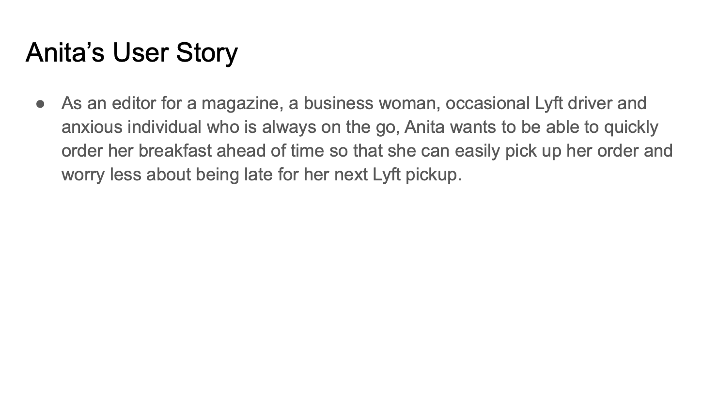
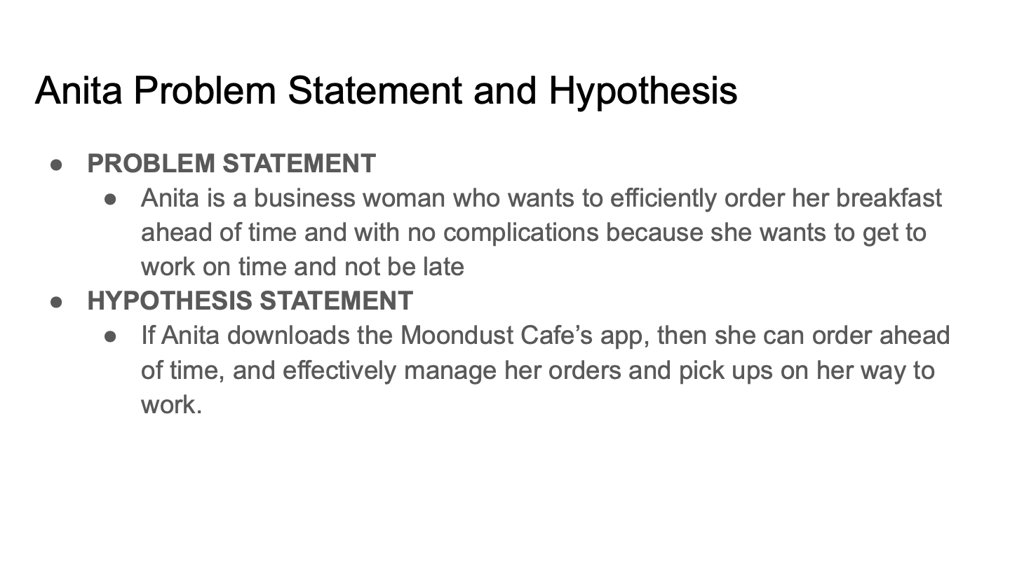
After researching each brand and completing interviews, I came up with user personas and stories based on what type of user would use the in-app menu for Moondust Cafe, and also reflected the research completed.
IDEATION
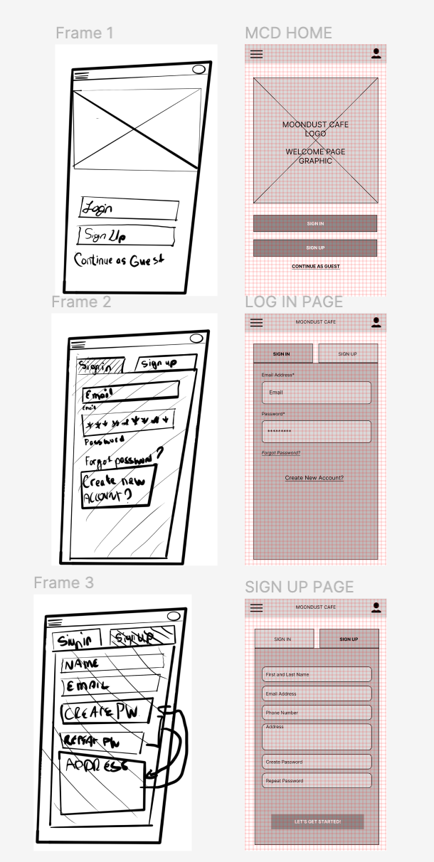
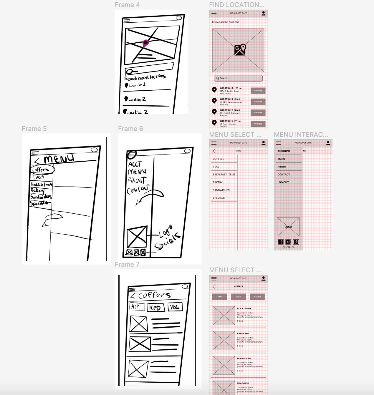
After figuring out who my target users were and an idea of a persona, I began sketching simple prototypes and a low fidelity prototype on Figma to get a good idea of what the app should look like based on research and prioritized the menu, user account and check out processing pages.
TESTING THE PROTOTYPES
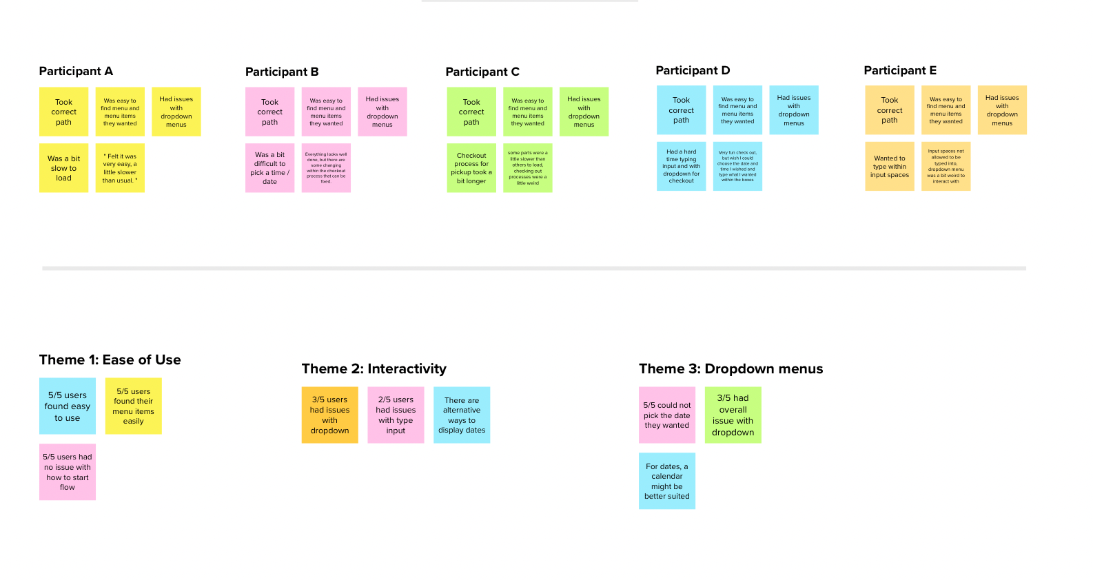
Prior to moving on to the high fidelity prototypes, I ran a few tests including a navigation rundown, sustainability user study and checked if there were any themes/ trends that users had when testing my product. I had asked them to navigate to the menu, order a black coffee and to order for delivery, then a second time, but order for pick up. I then compiled all notes to see how I can integrate user feedback within the work.
PROCEEDING TO HIGH FIDELITY PROTOTYPES
Once I compiled all my notes, I knew the menu was the easiest part to navigate within the app. The check out processes and navigation needed to be changed as one user went through a different flow pattern than I had originally planned. I also wanted to ensure that language could be changed within the first page of the app prior to signing in. I also needed to change the account page so it was easier and clearer to read and was able to be editable. I also needed to change my approach on how people signed in/up for the app, since 2 of the 5 users had issues on which route to take.
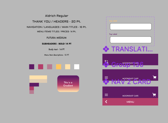
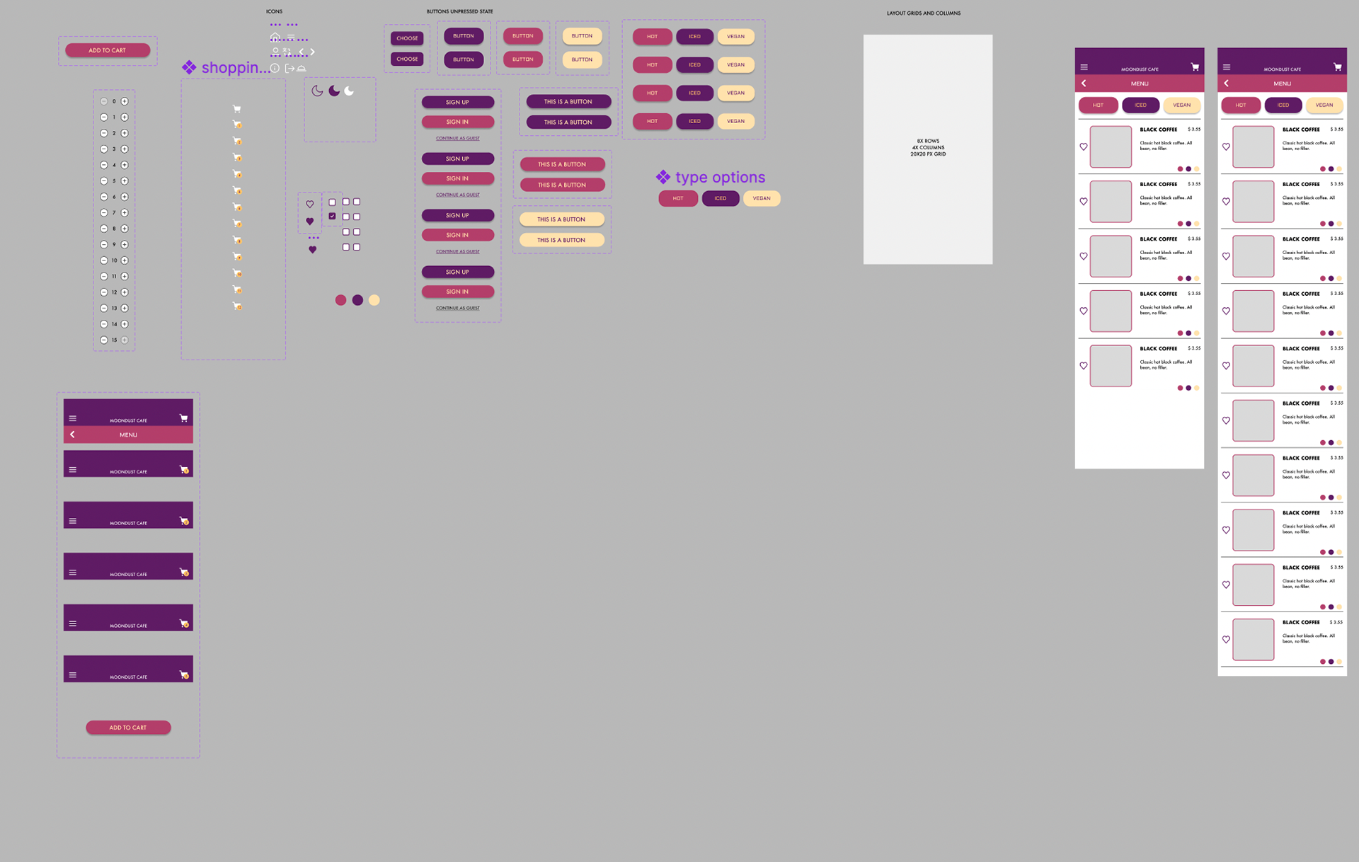
DESIGN ASPECTS AND SYSTEMS
When I thought of the brand, the night sky and old cafe color themes had come to mind. I decided to use colors that depicted the sky during sunset into dawn, thus the pinks, yellows and purple used throughout the design. I also wanted to play upon the theme of space and used typefaces that mimicked old technology as well as Futura, which coincidentally was the first typeface on the moon. Here, I boult upon layouts of the menu, account pages and overlays to be used in the app.
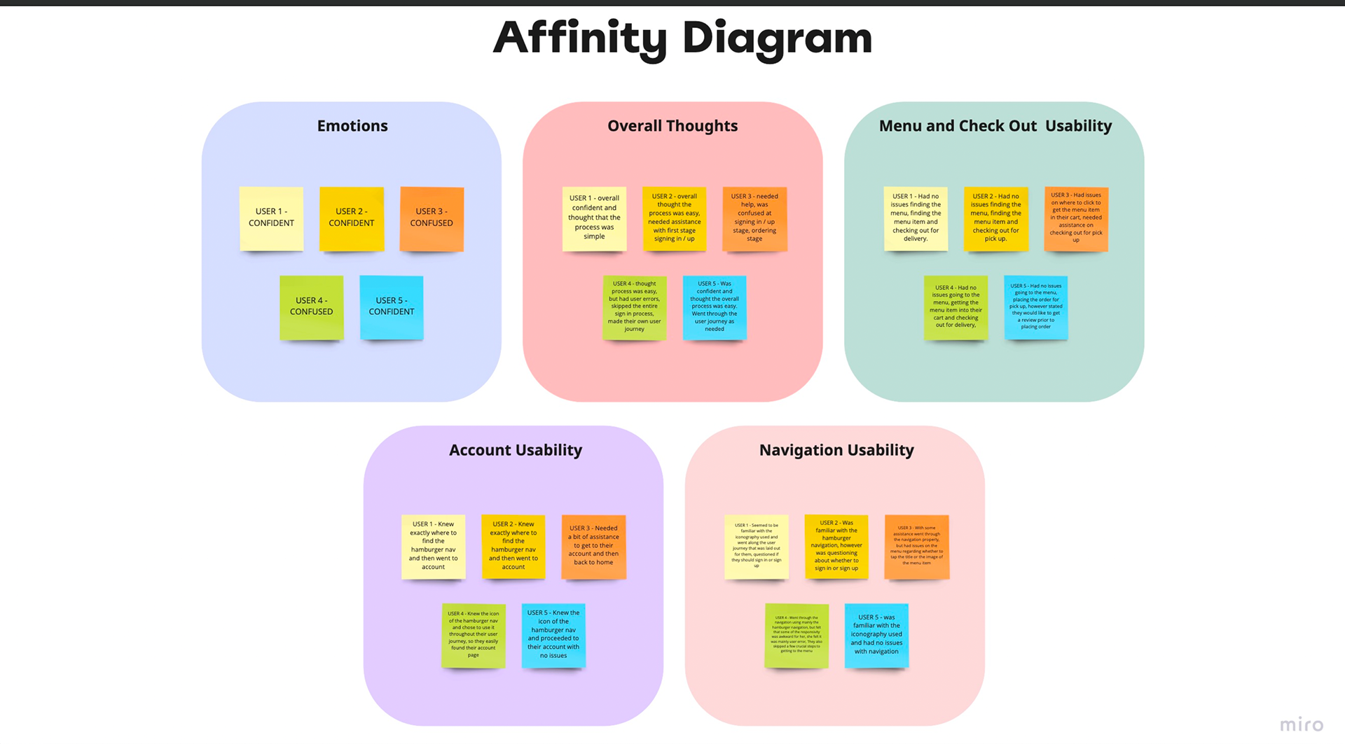
HIGH FIDELITY TESTING
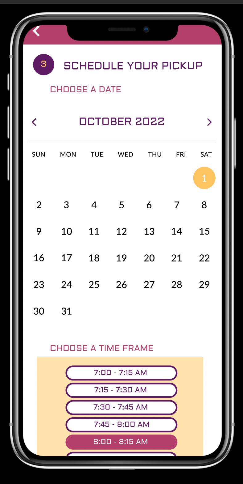
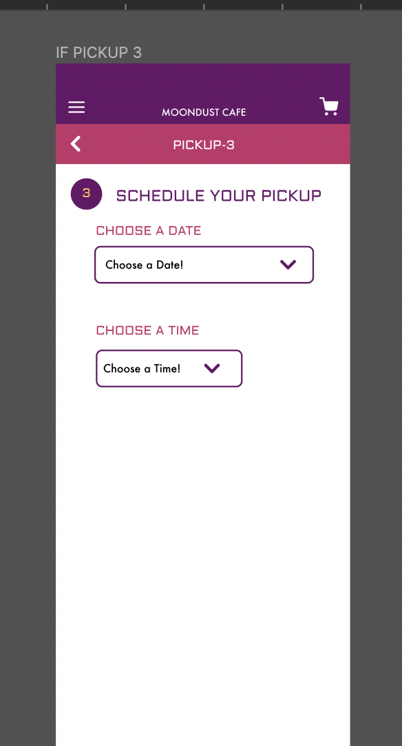
I began to do another user sustainability test as well as an affinity table to show themes of what people had thought of the app now that it was high fidelity and if it was close to how the app should be. I realized that there could be some changes made, such as, instead of "choose a date" dropdown menus, I can change it to a simpler and legible calendar date picker instead. I also realize I need to try to make the app more interactive within the text to make it seem as close to reality as possible.
UPDATING THE HIGH FIDELITY PROTOTYPE
After reconsidering the research, I wanted to work upon the time / date dropdown menus in order to make it easier for the customer to pick up their order.
BEFORE